Contact Us
Give us your email and phone number and we will be in touch with a short questionnaire to help us discuss your project in more detail.
Clearly,
symbolically
symbolically
Task
Polisan remedies line rebranding.
The medication should work. The medication packaging too.
:OTVETDESIGN rebranded Polisan remedies line. The brand has developed its own functional symbol system, with which it is convenient and simple to label all products.

The system is based on the principles and elements of various cryptographic alphabets.
We encoded pharmacological features, dosage forms, and methods of using the medication into symbols, thus creating a new medical language — structured and easy to use by medical professionals.


The system is easy to remember: it has a small number of elements, the meaning of which is intuitively understandable.
The minimalistic design focuses on the main thing — instructions. It is made in black and white with the help of concise symbols that help identify the medication.
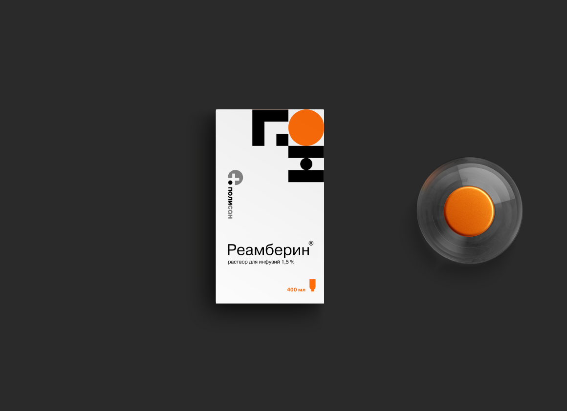


Large visual elements of the system successfully serve two functions: information and design. The color palette also works on the usability of brand products. Color coding helps to divide medication for different purposes, as well as add dynamics and modernity to the strict black and white range of branded packaging.
The result was not just packaging. We have created a unique alphabet of medications, which is much simpler, clearer, and more practical even than Latin.

Other consumer branding projects
Other consumer branding projects
Let's talk about your project
Tell us about your goals, and we'll get back to you right away!
OTVETDESIGN Communications agency © 2013–2023
Office 706, BC Omega Plaza, Leninskaya Sloboda street, 19, Mosсow, Russia, 115280
hello@otvetdesign.ru