Contact Us
Give us your email and phone number and we will be in touch with a short questionnaire to help us discuss your project in more detail.
La-Kri
Rebranding
Rebranding
Task
Develop a consumer branding and packaging design project for the cosmetics line caring for the skin of people of different ages.
The target audience is parents who wish to provide the maximum care for their children. As well as adults who wish, at least for a little while, to feel being small again and experience attention to them and their health.
Context
La-Kri brand has for a long time existed in the market as an expert in finding solutions for baby skin care: dryness, itching, flaking.
Vertex holding made a decision to expand the successful lineup by including the skin care cosmetics for adult and teen-age skin and the "solar" line. The reoriented brand needed a new ideological base and packaging.
Strategy
The fundamental expansion of the product line always raises issues for the marketing department. Especially, when the audience is transforming from the narrow and clear to the far broader one. Given the positive background of the brand we did not want to deviate a lot from La-Kri's past positioning. How to maintain the positive experience of the brand which "grew out" from the "panties"?
Care is a common feature of all the products of the brand. Skin care means care about people whose skin needs care.
And age is not so important because everyone, even the biggest and the most adult, occasionally want to feel being small again, to get a dose of attention and tenderness. Big and adult occasionally want to trust someone sympathetic, expert, "grown-up" and not to keep everything under control. With La-Kri everyone can feel being small again, and the phrase "skin like a baby" is not just a metaphor any more.

Concept and Implementation
La Kri feel about people with such a big, great big care that let everyone feel being small again. Get back to childhood. When the world is full of kindness, discoveries and sunshine. When everyone around loves you and fear exists only in fairy-tales and behind the locked doors of the dark closet.
When the world is painted in bright colors and Granny is saying that you have the tenderest cheeks in the world.
With La-Kri everyone can feel being small again, and the phrase "skin like a baby" is not just a metaphor any more.
With La-Kri everyone can feel being small again, and the phrase "skin like a baby" is not just a metaphor any more.


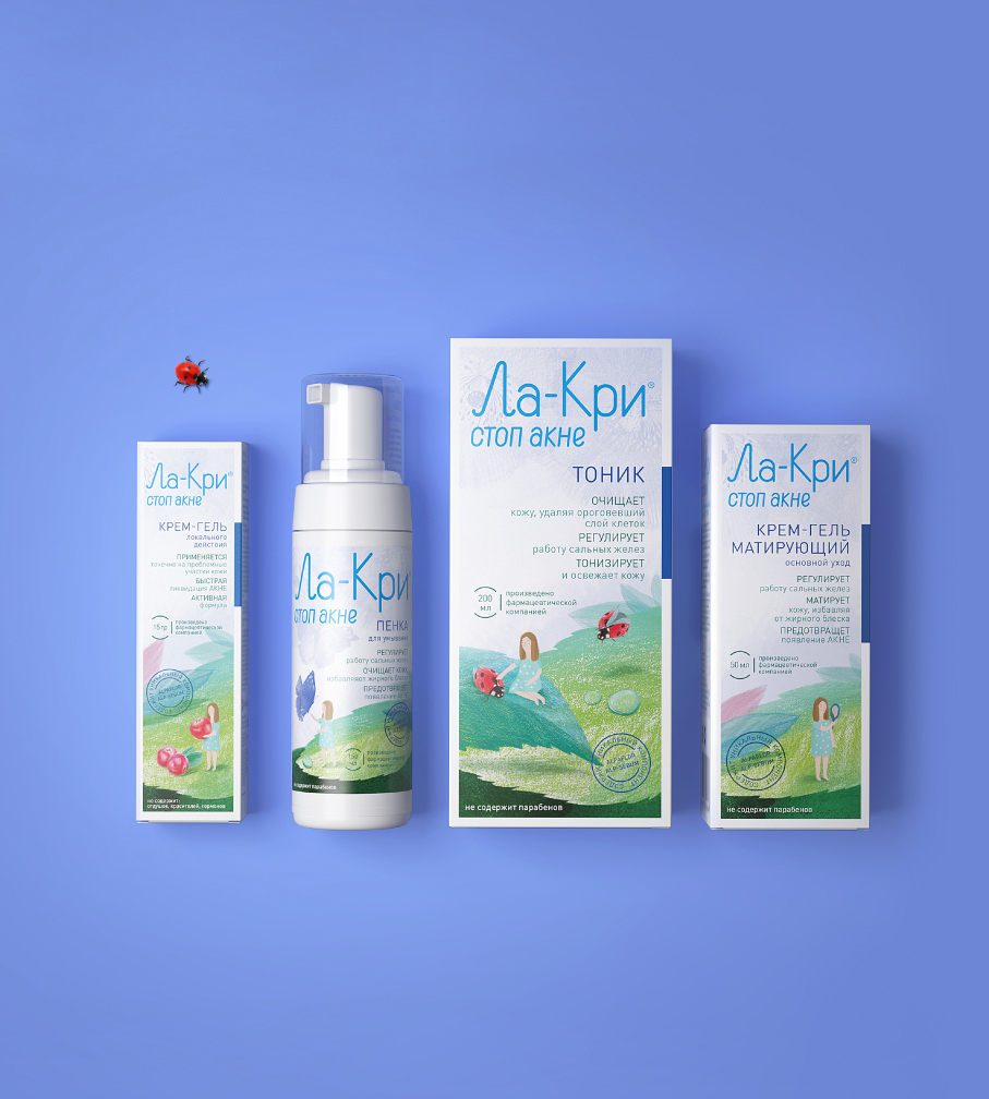


The whole new world blooms on La Kri’s packaging. Cozy and a bit fairy, it surrounded the trademark’s tiny persona with kindness and attention. No room for dangers, the weather is always fine and there is nothing to be afraid of.
Cozy and a bit fairy, it surrounded the little lyrical heroine of the brand with kindness and attention.

Truly emotional authors' graphics has not only formed the unique image of the new lineup but created a specific atmosphere of kindness, calm and harmony "irradiated" by La Kri packaging.
The paper chosen for the label is a little bit rough and tactually enjoyable and it makes the fairy world distinctively volumetric as if it can be touched with the fingers.

Other consumer branding projects
Development of a brand idea for the brand of products for slimming and body shaping
Packaging redesign of the professional hair care products
Redesign of the brand of intimate personal care
Other consumer branding projects
Development of a brand idea for the brand of products for slimming and body shaping
Packaging redesign of the professional hair care products
Redesign of the brand of intimate personal care
Let's talk about your project
Tell us about your goals, and we'll get back to you right away!
OTVETDESIGN Communications agency © 2013–2023
Office 706, BC Omega Plaza, Leninskaya Sloboda street, 19, Mosсow, Russia, 115280
hello@otvetdesign.ru