Contact Us
Give us your email and phone number and we will be in touch with a short questionnaire to help us discuss your project in more detail.
Le Santi
Task
Create a positioning strategy and branding of a new brand of products for slimming and body shaping developed in France.
Most women are not satisfied with their look.
Even women with perfect forms. That is the way women are. That is the way the world wags. Therefore, products aimed at body perfection is of relevance today. As it has always been.
The target audience is women living in an active rhythm and keeping up to date.
Leaders of opinions, their vanity bags and outfits numerous girls copy. They work at self-improvement, but they also require a lot. Caring for beauty is no exception. The uniqueness of the product, its innovativeness and effectiveness — these are the key arguments in choosing.

Not particularly distinguishable from each other, they "sell" centimetric tapes, scales, slender bodies of celebrities are pretty trite pictures lacking individuality and, most importantly, accurately formulated message. The visual images of competitors are about abstract slenderness, which advantages are already obvious for long.
At the same time, they do not have a clear answer to the main question: "What exactly on slimming issue does a specific brand promise a specific woman?" In such a situation, one who can accurately formulate and convey its message to the audience will receive everything. Or rather, the most active part of the audience.
Продукты,
в настоящий момент представленные
на полках аптек,
в основном используют «лобовой» подход.
в настоящий момент представленные
на полках аптек,
в основном используют «лобовой» подход.
Products currently offered on the pharmacy shelves mainly use the "frontal" approach.


However, you should change yourself for that. Your body is not a cage where the graceful beauty is languishing. There is no need to torture your body to become a different person. It is an important part of you, your ally. It should not be broken, striving to become another person, but you can change it, by making it more comfortable.
The gentleness of the approach does not mean weakness of the result. They should be — and should be noticeable. Otherwise, why start, spend energy on this? Appreciate yourself, value your time and choose what will work.
Метаморфозы как глобальный вектор движения марки. Мир можно изменить.
Metamorphoses are as a global brand movement vector. The world can be changed.
Strategy
Le Santi is the personality-brand
The method of "the photo of a pretty girl is a motivation to slim" does not work — neither on the fridge nor on the packaging. The agency should find a new deep image that could simply and clearly convey the brand’s general idea.

Whether it is the rules for packaging design in a segment or the body that is entrusted to it. We neither offer role models nor draw away to pipe dreams. We provide efficient products for working with what you have. With your own body.
Why focus on an unattainable ideal, measured in kilograms and centimeters of strangers from glossy magazines? Everybody has their own questions, requests, and problem zones. Le Santi works aiming, where necessary, and as it is needed — effectively changing your outer world to the joy of the inner world.
Le Santi — марка-личность, способная менять то, к чему прикасается.
Le Santi is a personality-brand that can change anything it touches.
Concept and Implementation
Brand image
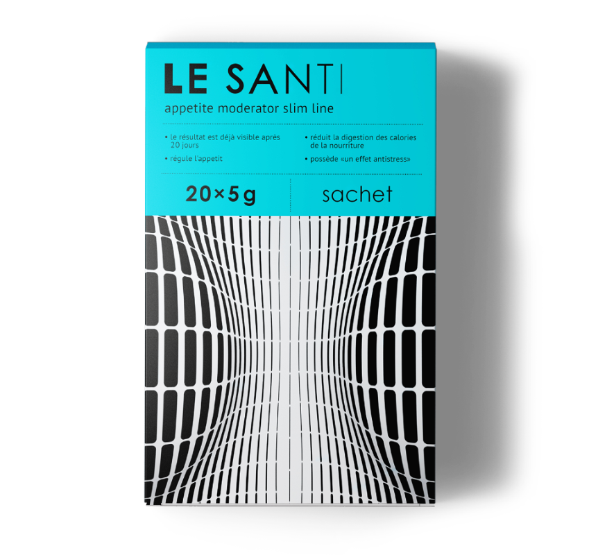
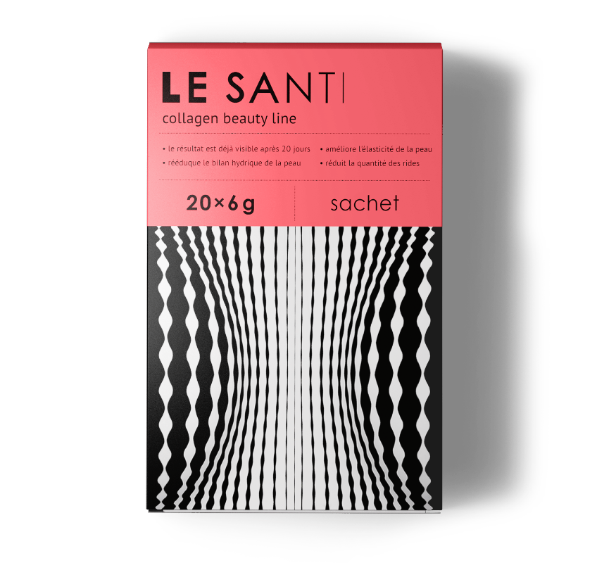
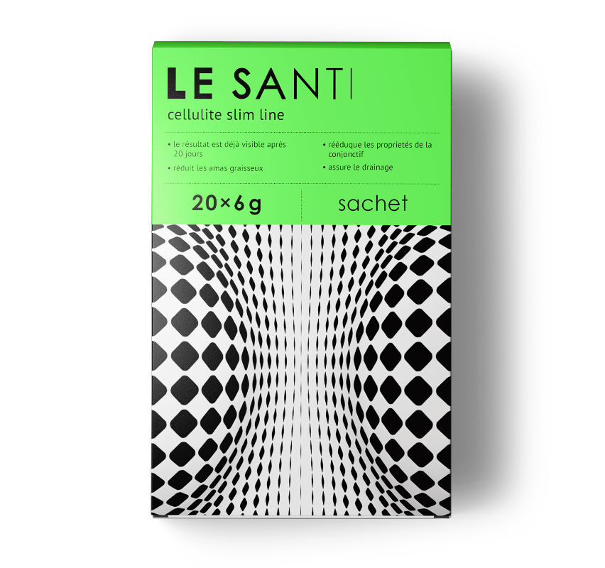
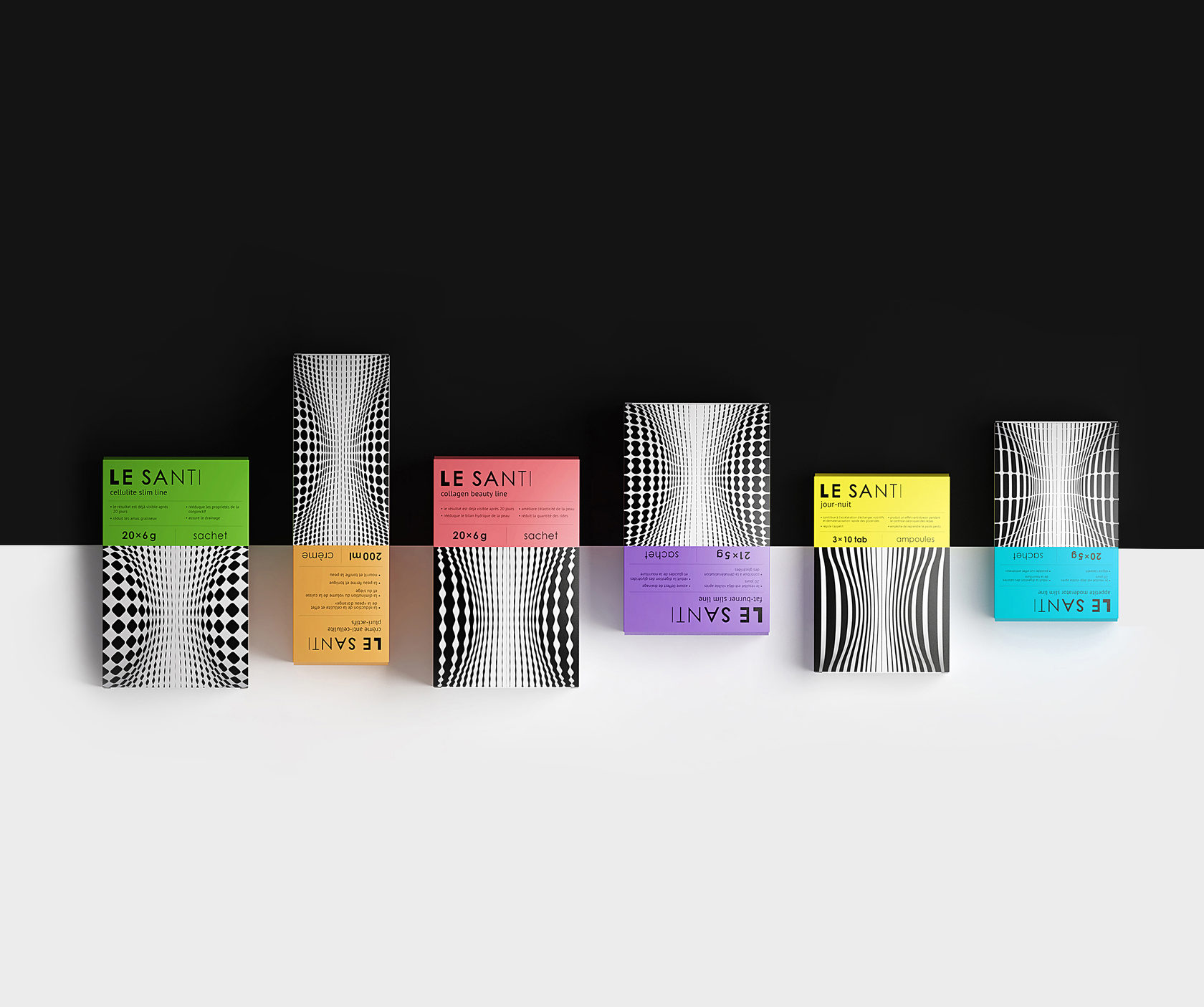
A drop became a suitable metaphor. The hypothetical drop of Le Santi. Its difference is that it can change the laws of nature. If an ordinary drop of water magnifies the object it gets on, then a drop of Le Santi, on the contrary, miniaturizes it.

Therefore, there is no need to depict it in each box. It is enough to imagine that we are looking at the packaging pattern through this drop. So now the picture is changing, creating a new silhouette, a new space and a new volume of reality.
Данный образ
не столь буквален, как сантиметровые ленты и модели.
не столь буквален, как сантиметровые ленты и модели.
Данный образ не столь буквален, как сантиметровые ленты и модели.
Сдержанный лаконичный логотип подчеркивает европейские корни марки, а также её специализацию — буквы в написании постепенно «худеют», обретая свою идеальную форму к концу названия.
The restrained laconic logo emphasizes the European background of the brand, as well as its specialization — the letters in the spelling gradually "slim", finding its ideal shape at the end of the name
This image is not as literal as centimeter tapes and models.
A more abstract visual image, a more concrete basic idea. Each packaging contains an individual print containing optical illusions. Color blocks of soft shades balance its activity. Bright but not flashy; effective but not annoying — the packaging helped convey both the character of the brand and its value.

The result is the unique packaging for the segment in terms of workup level and ideological load.


Red Dot Design Award 2016
Our packaging for Le Santi figure correction tools was at the top of the charts again. Here the period comes. Thank you.

Other consumer branding projects
Other consumer branding projects
Let's talk about your project
Tell us about your goals, and we'll get back to you right away!
OTVETDESIGN Communications agency © 2013–2023
Office 706, BC Omega Plaza, Leninskaya Sloboda street, 19, Mosсow, Russia, 115280
hello@otvetdesign.ru