Contact Us
Give us your email and phone number and we will be in touch with a short questionnaire to help us discuss your project in more detail.
Nairi Insurance
Nairi Insurance
Nairi Insurance
Task
Rebranding of the first private insurance company in Armenia.
The main competitors — Rosgosstrakh and Ingosstrakh — are Russian brands. With an appropriate powerful background, brand fame and large-scale budgets.
In the context of strong competitors, Nairi needed to find its unique identity, which could become an additional trump card when working in the country.
In the context of strong competitors, Nairi needed to find its unique identity, which could become an additional trump card when working in the country.
Nairi is one of the three leading insurance companies in Armenia and the only national in it.
Context
Most voluntary insurance services are either not developed or available at the legislative level only for the B2B segment.
However, in the near future the situation should start changing. For a company planning a long and successful work on the market, it was important to be proactive.
However, in the near future the situation should start changing. For a company planning a long and successful work on the market, it was important to be proactive.
The insurance market in Armenia differs significantly from the Russian one. The main products in the industry are still compulsory insurance services.
Industry
"Our main corporate code and a distinguishing feature in contrast to competitors is "non-Russianness." The Armenian national component. It is not only about Armenian capital (it stays in the country), but also about Armenian identity"
co-owner of Nairi

"My clients call me at 2 a.m. On almost any issue. Whether he quarrels with his wife, questions to the bank or a checkup — they call. You should be known as a person who decides everything and always helps. It is essential"
"They (employees on the client side) are used to the fact that this is THEIR VERONIKA who always communicates with them. For me, the issue of personal relationships is also very important. I am very pleased to work with my manager"
"How have I collected my base?" These are all acquaintances and acquaintances of acquaintances. My family is big — there are relatives, brothers, classmates, friends, neighbors. Everyone is addressing me now. Because they know me and know how I work."
Nairi agent office in Abuvyan
Nairi corporate client
Nairi agent office in Yerevan
The peculiarity of building not only interpersonal, but also business contacts in Armenia is that any issue is solved through people. Personal contact, ease of communication, not only geographical, but also human intimacy — all these are important factors for building long-term cooperation and formation loyalty in the country.
Based on the research, as well as taken into account the company’s internal corporate code, a new brand platform was formulated.
Nairi is a company-neighbor. A brand that lives in the immediate vicinity of its customers and therefore understands them like no other. You know us, and we know you as well. And this is the secret of the convenience of working with us. Products created with a full understanding of the market specifics. Business processes are cut out for the Armenian mentality. Offices located next door are always open to you.
Nairi is a company-neighbor. A brand that lives in the immediate vicinity of its customers and therefore understands them like no other. You know us, and we know you as well. And this is the secret of the convenience of working with us. Products created with a full understanding of the market specifics. Business processes are cut out for the Armenian mentality. Offices located next door are always open to you.
Platform

Based on the research, as well as taken into account the company's internal corporate code, a new brand platform was formulated.
Nairi is a company-neighbor. A brand that lives in the immediate vicinity of its customers and therefore understands them like no other. You know us, and we know you as well. And this is the secret of the convenience of working with us. Products created with a full understanding of the market specifics. Business processes are cut out for the Armenian mentality. Offices located next door are always open to you.
Nairi is a company-neighbor. A brand that lives in the immediate vicinity of its customers and therefore understands them like no other. You know us, and we know you as well. And this is the secret of the convenience of working with us. Products created with a full understanding of the market specifics. Business processes are cut out for the Armenian mentality. Offices located next door are always open to you.
Platform


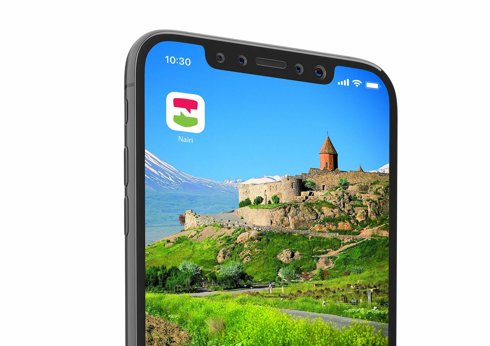
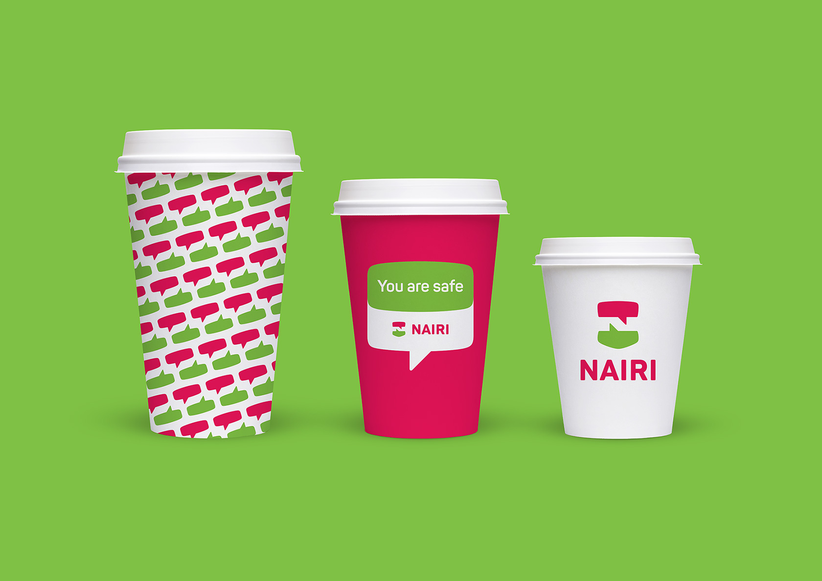
The updated logo of the brand is the capital letter of the name made from two multi-colored bubbles — a metaphor for informal dialogue, human communication. The sign has a second interpretation — a shield symbolizing safety and care for the client and his well-being.
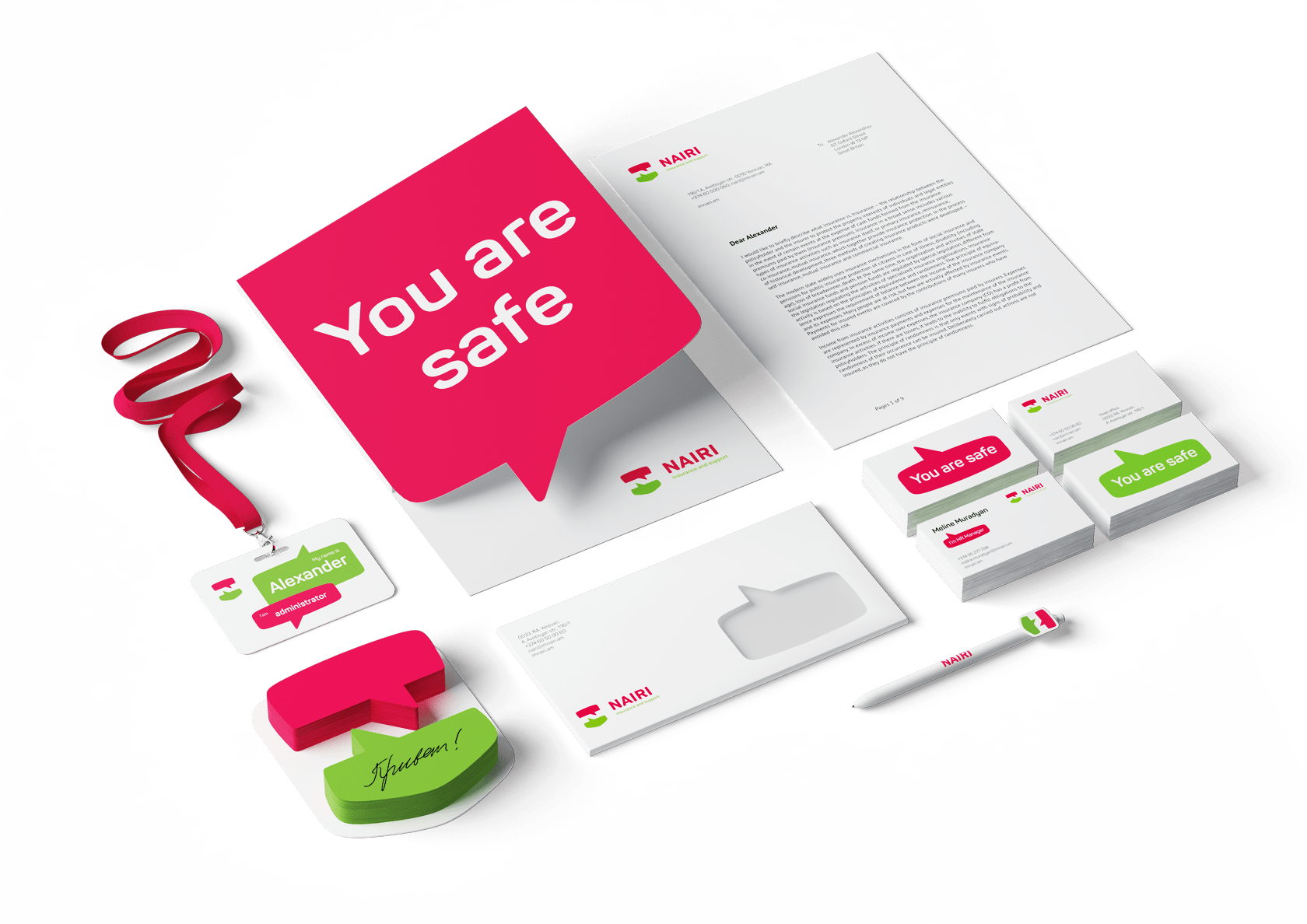
The choice of bright, rich colors of corporate identity is nonrandom. Juicy green and vibrant pink are directly contrasted with restrained "respectable" industry colors. This technique allows to emphasize the company’s uniqueness, its flexibility, lack of formalism.
The semantic constant of corporate identity is the image of a bubble, which has already appeared in the logo. The brand literally enters into communication with its consumers — neighbors in the country.
The semantic constant of corporate identity is the image of a bubble, which has already appeared in the logo. The brand literally enters into communication with its consumers — neighbors in the country.
Brand Style


The final stage of the project was the working out a brand book. Full information about a new brand platform, rules of using the logo, corporate identity standards, media design molds — all this is collected in one document which will allow to effectively and structurally manage the brand, as well as its counterparts to work correctly with the brand visual and semantic identity to.
Brandbook


Other corporate branding projects
Logo redesign and new corporate style development for Bank of Russia — the Central Bank of the Russian Federation
Rebranding of Sadovye kvartaly residential community
Development of a brand identity for a participant of Top 10 the largest leasing companies
Other corporate branding projects
Logo redesign and new corporate style development for Bank of Russia — the Central Bank of the Russian Federation
Rebranding of Sadovye kvartaly residential community
Development of a brand identity for a participant of Top 10 the largest leasing companies
Let's talk about your project
Tell us about your goals, and we'll get back to you right away!
OTVETDESIGN Communications agency © 2013–2023
Office 706, BC Omega Plaza, Leninskaya Sloboda street, 19, Mosсow, Russia, 115280
hello@otvetdesign.ru