Contact Us
Give us your email and phone number and we will be in touch with a short questionnaire to help us discuss your project in more detail.
Task
Logo redesign and new brand identity development for Bank of Russia — the Central Bank of the Russian Federation.
The logo of the largest financial institution is not the exception. Having kept the idea of the previous Bank of Russia character we revised it by having made it more precise, expressive and complete.
Anything referring to finances needs for maximum accuracy.
Logo

The main character detail is reduced for perception enhancement under scaling.

The mark of the widest scope and movement ahead has become the constant of the regulator' image.
The circle of a horizon breaks down any carrier of Bank of Russia into sky and land. Different color density for the upper and lower blocks enables emphasizing such features as sustainability and reliability (for land) and prospects and ability to look further (for sky, made in gradient)
The circle of a horizon breaks down any carrier of Bank of Russia into sky and land. Different color density for the upper and lower blocks enables emphasizing such features as sustainability and reliability (for land) and prospects and ability to look further (for sky, made in gradient)
For brand identity we introduced a new visual metaphor of a horizon.
Brand identity


It was critical to think out the images of any and all corporate editions — both in-house and related to the external context. Such a thorough approach enabled creating a full-fledged template library which will significantly ease the further communication management for Bank of Russia on all the levels.
The Bank of Russia communication strategy presumes a high activity in development of multipage editions.
Multipage editions


For the regulator, we developed the digital guide which among other things included suggestions concerning the changes for corporate website and representation character of Bank of Russia in the social media.
In the present-day world the brand life is impossible in offline only.
Digital


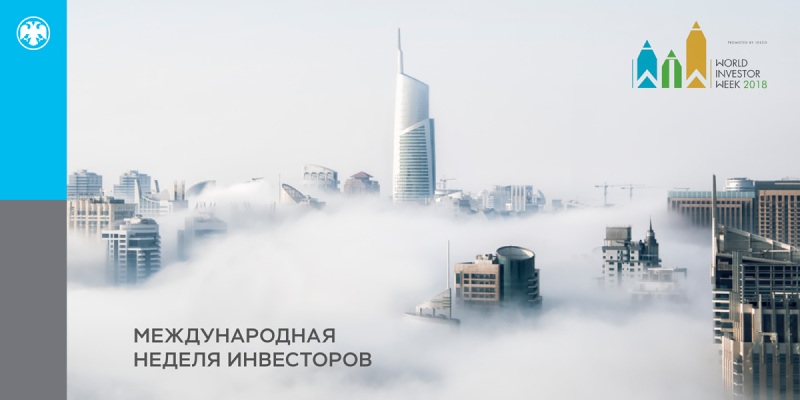


presumes using the same scale solutions in consumer communication. For the Bank of Russia, we thought out options for graphic design of contact points at the events of different level and specialization.
The scale of activity of the country’s largest financial institution
Event branding


The brand identity standards are developed and described in points of detail; it enables the company’s workforce to proceed with designing some of the carriers on the own authority and still sticking with slenderness and consecution of the Bank of Russia visual identity.
The unique feature of a new brand book is its maximum minuteness.
Guide

Full guidelines
Brand book considers all the types of carriers and provides the detailed examples of good and inappropriate use of the brand identity elements. Instructions for using typeface are given. Principles of communication feed are developed. Use of website scheme, website support and content filling are created.

Other corporate branding projects
Rebranding of the first private insurance company of Armenia
Rebranding of Sadovye kvartaly residential community
Development of a brand identity for a participant of Top 10 the largest leasing companies
Other corporate branding projects
Rebranding of the first private insurance company of Armenia
Rebranding of Sadovye kvartaly residential community
Development of a brand identity for a participant of Top 10 the largest leasing companies
Let's talk about your project
Tell us about your goals, and we'll get back to you right away!
OTVETDESIGN Communications agency © 2013–2023
Office 706, BC Omega Plaza, Leninskaya Sloboda street, 19, Mosсow, Russia, 115280
hello@otvetdesign.ru