Contact Us
Give us your email and phone number and we will be in touch with a short questionnaire to help us discuss your project in more detail.
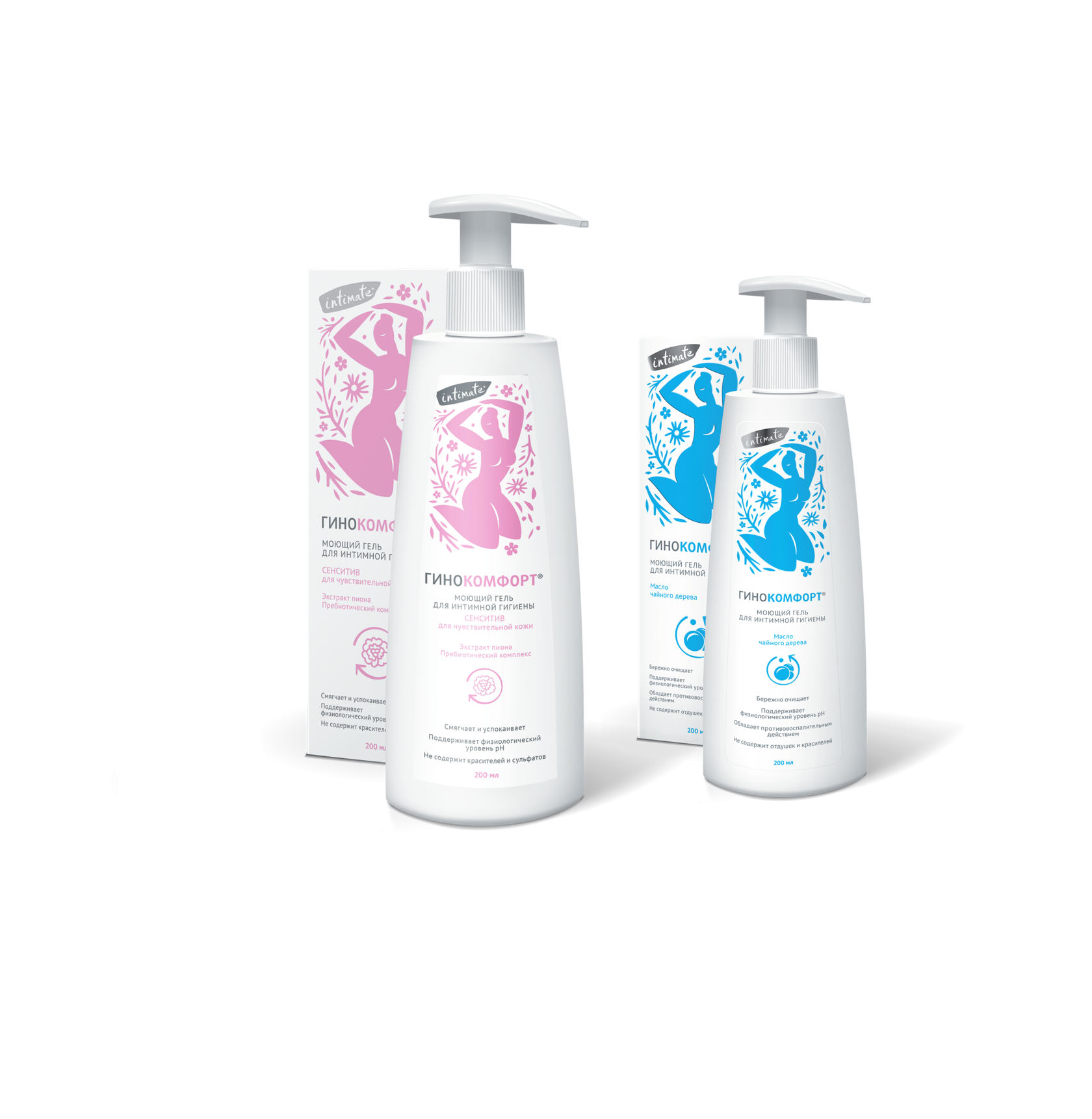
Develop an advertising campaign in the press of the products line for Ginokomfort female intimate hygiene
The main USP of the brand is the delicacy of all products of the line.
Product
Specifity
Delicacy, in the case, was required not only from the cleansing products themselves but also from the brand communications. It was important to denote the specifics of the product, without going into physiological details that could confuse the audience.


Solution
The conciseness of the method and the accuracy of the image helped to smooth things over, making the communication very understandable without causing embarrassment or rejection among the target audience.
A good metaphor is the best way to correctly and tell clearly about a sensitive issue. The flower is a symbol of beauty, tenderness, femininity, and care. So in our interpretation, it also means careful attention to the intimate area.


Other communications projects
Advertising campaign for Plus line of Asepta brand
Advertising campaign for Paradontal line of Asepta brand
Communications strategy development for concrete admixtures of BASF brand
Other communications projects
Advertising campaign for Plus line of Asepta brand
Advertising campaign for Paradontal line of Asepta brand
Communications strategy development for concrete admixtures of BASF brand
Let's talk about your project
Tell us about your goals, and we'll get back to you right away!
OTVETDESIGN Communications agency © 2013–2023
Office 706, BC Omega Plaza, Leninskaya Sloboda street, 19, Mosсow, Russia, 115280
hello@otvetdesign.ru