Contact Us
Give us your email and phone number and we will be in touch with a short questionnaire to help us discuss your project in more detail.


Logo
Identity
Creating a visual identity for Astrasend, an international money transfer provider
Money transfers made friendly
Astrasend is an approachable and ambitious international money transfer provider. Our task was to create a visual identity to properly reflect the brand and communicate its openness and fresh perspective.
Idea
The visual metaphor — the aster flower — was derived from the brand’s name. The colors of the new identity are a direct reference to the garden plant, while the divergent rays bring to mind the Ancient Greek word that the flower got its name from, which literally means ‘star'. Each ray ends in a pointer that adds direction and movement — an apt solution to convey the of idea sending money to someone long-distance.
Logo
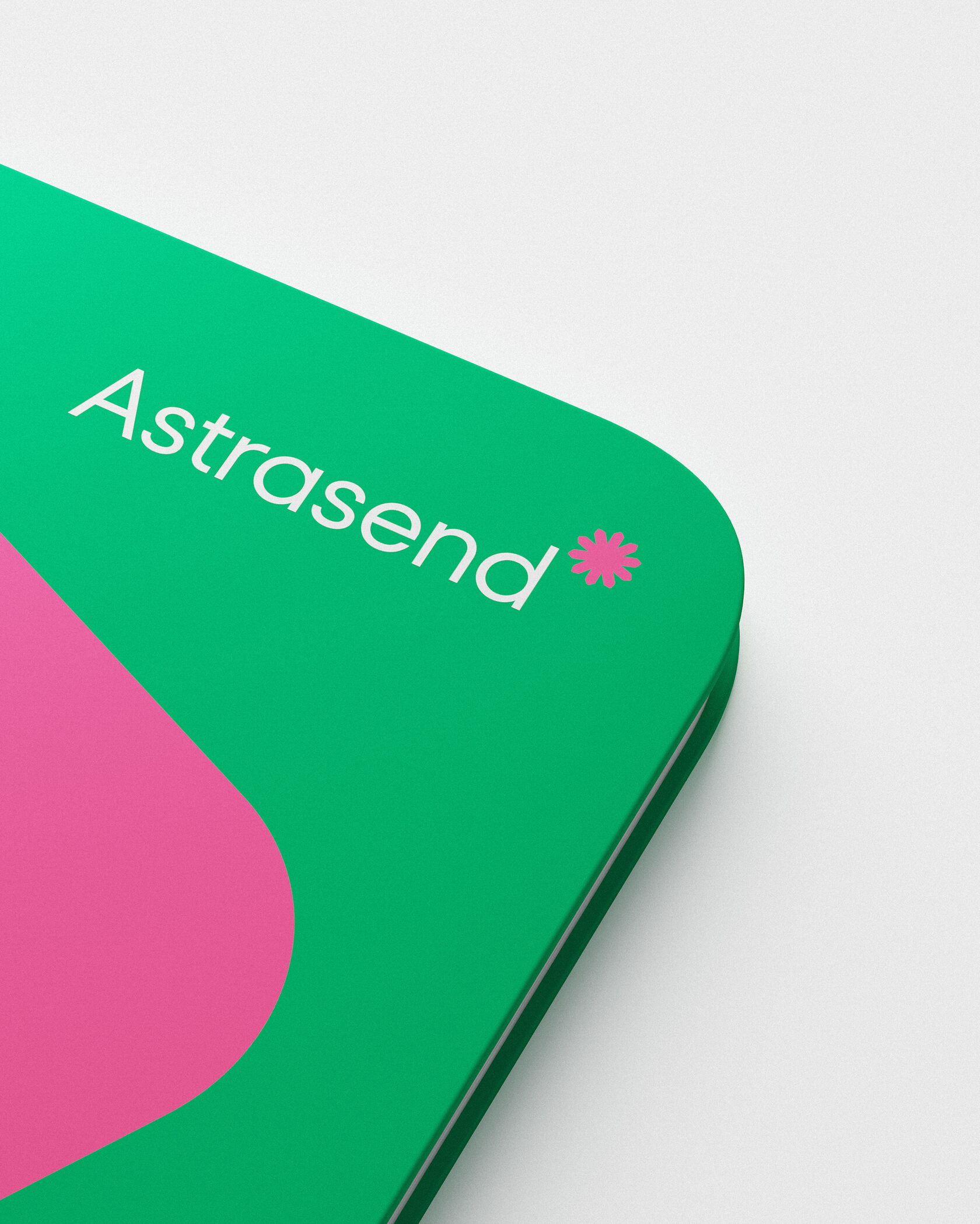
The idea was summarized in the logo that brings together the brand’s narratives and attributes and blends them into a simple yet expressive image.
Visual identity
The visual identity elements logically follow from a pointed ray — it transforms into a brand shape when expanded. Its outlines are a reference to direction pointers; this device can be used independently, as a graphic element, or as a background for photography.
Mascot
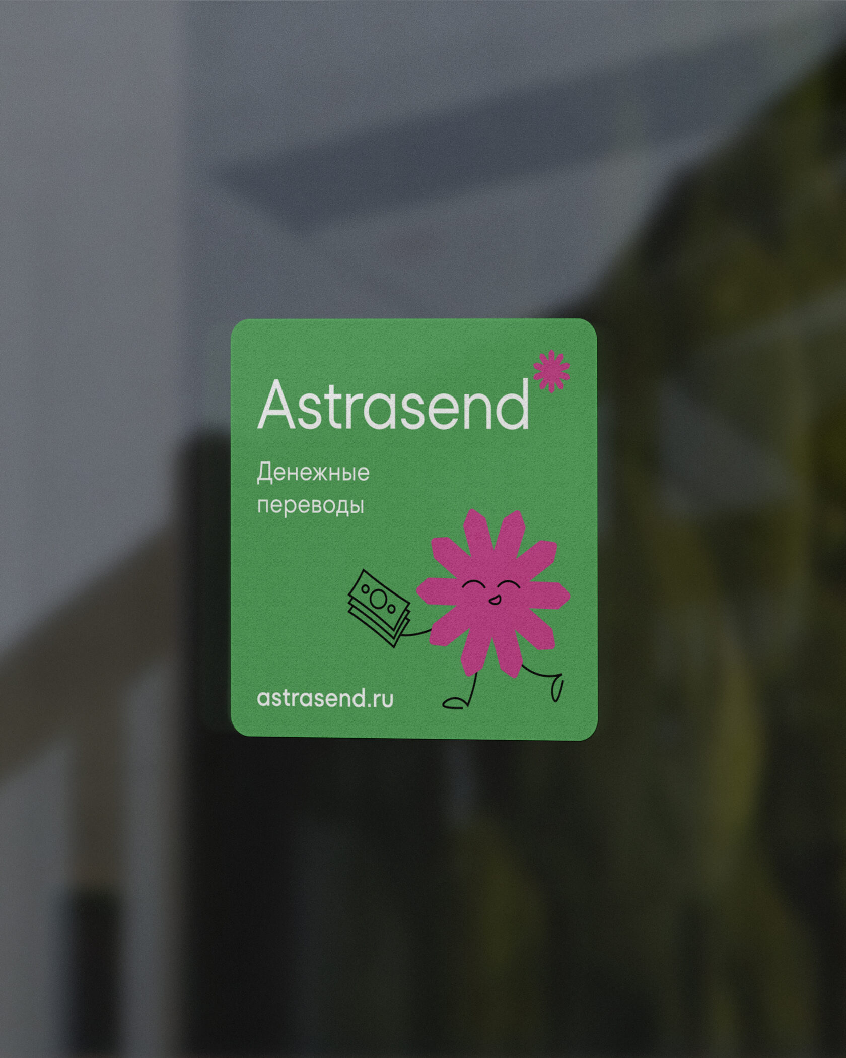
To make sure that the visual identity can evolve across the various communications formats, we created a distinctive mascot — a logo-based character with simple yet expressive features.
The mascot has a sociable and creative personality and comes across as innocent and friendly. Thanks to its charisma, it can express all kinds of emotions and even act as an assistant or consultant. For example, it can serve as an assistant for website or mobile app users.
The mascot has a sociable and creative personality and comes across as innocent and friendly. Thanks to its charisma, it can express all kinds of emotions and even act as an assistant or consultant. For example, it can serve as an assistant for website or mobile app users.

Style guide
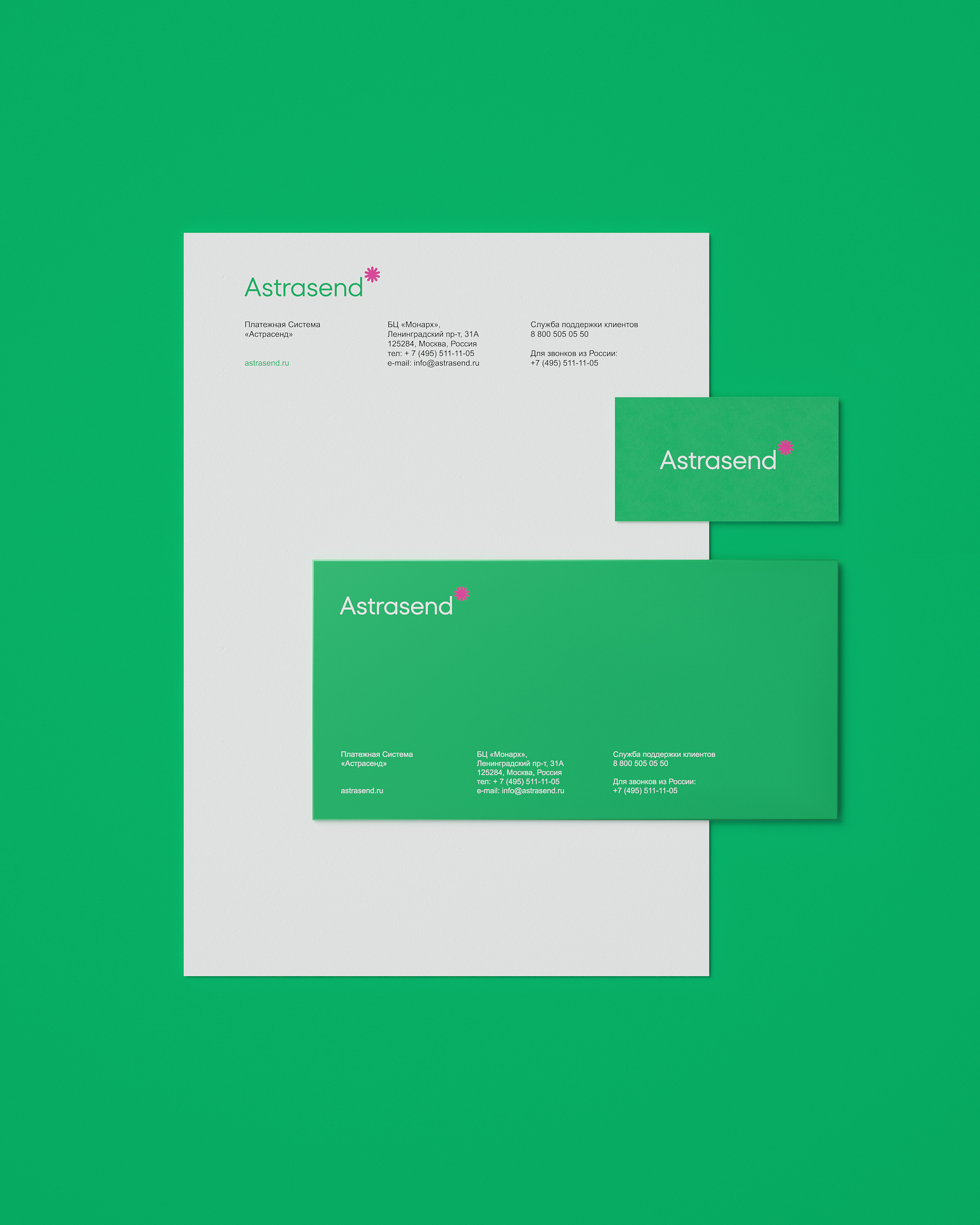
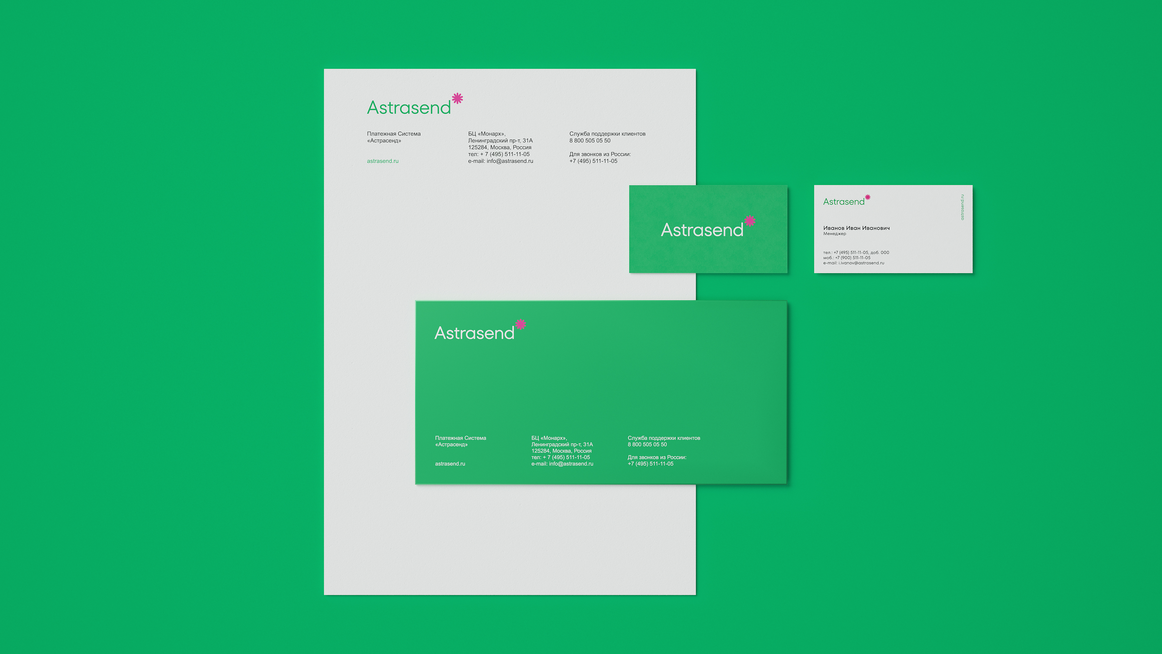
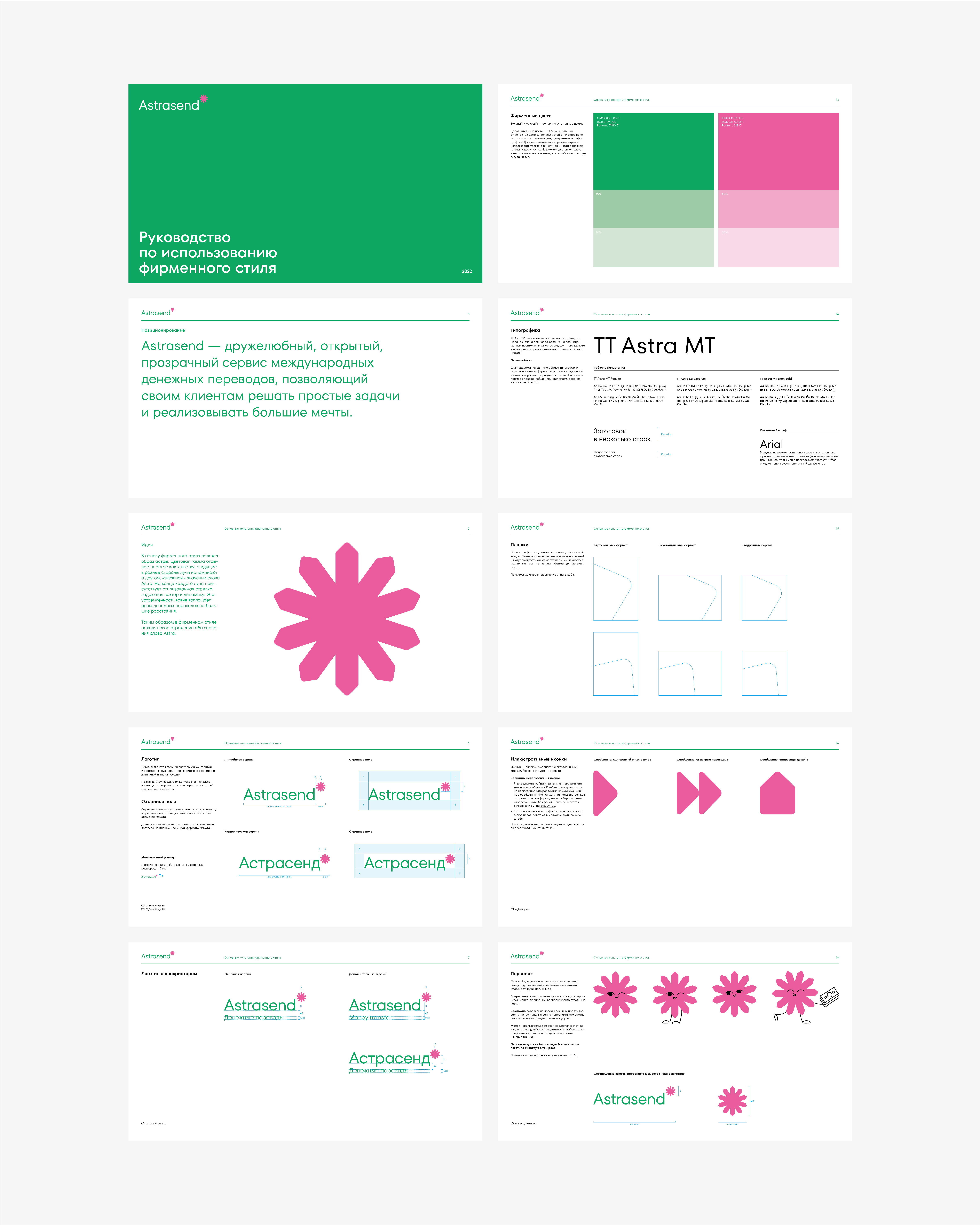
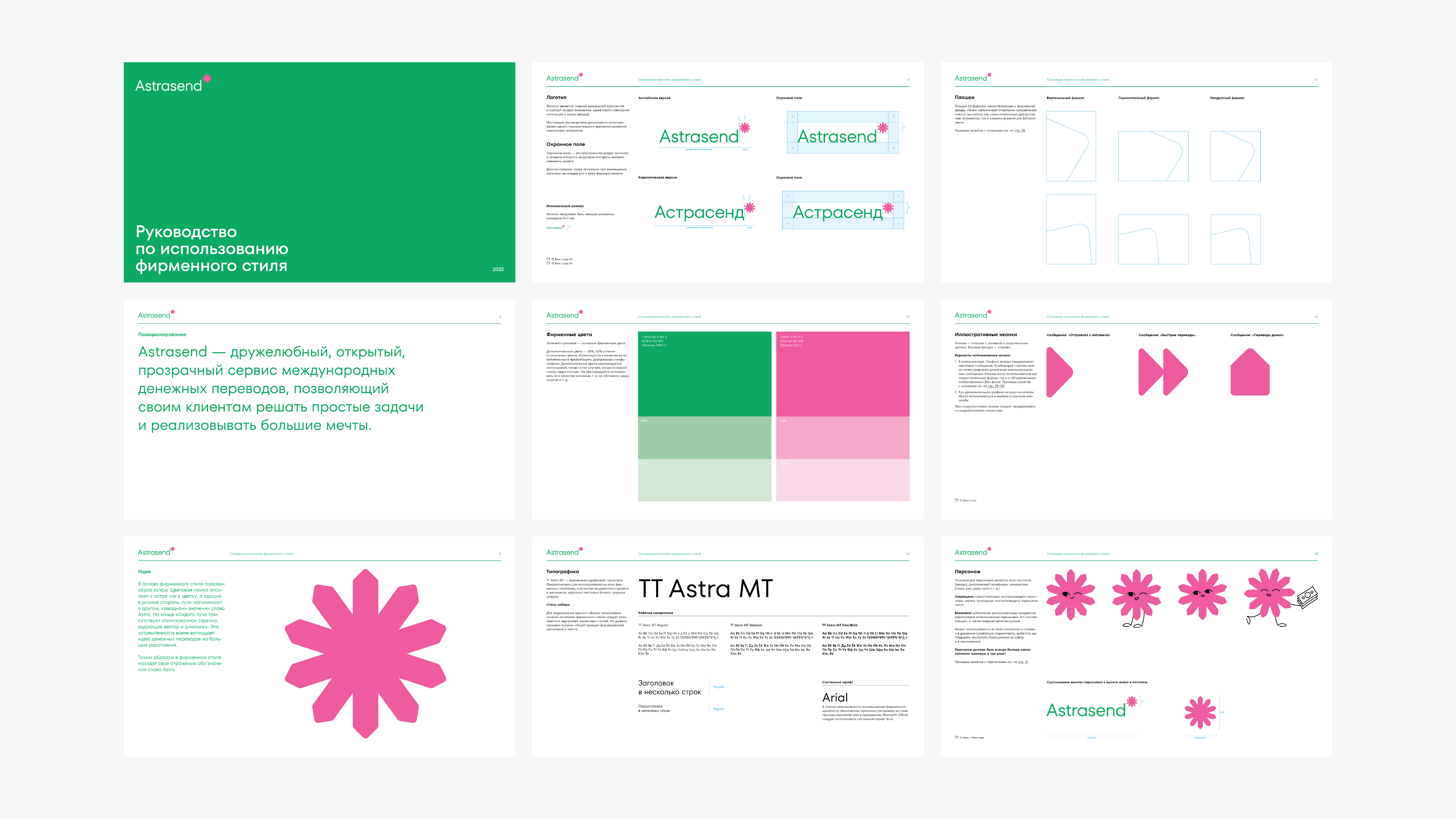
To make sure that the visual identity is successfully used in various communications channels, we created a detailed brand style guide. The document formalizes the brand’s visual identity system and breaks down the rules of use. Each visual identity element comes with a specific set of dos and don’ts that apply to all kinds of marketing and brand collateral — from business documents to mobile app icons.
Place branding
A comprehensive rebranding project for Rusgranit
Branding and communications development: a comprehensive project for M2_Connect, a digital service provider
