Contact Us
Give us your email and phone number and we will be in touch with a short questionnaire to help us discuss your project in more detail.
Logo
Identity
Creating a place brand for Russia’s Surgutsky Municipal District
The Gem in the North
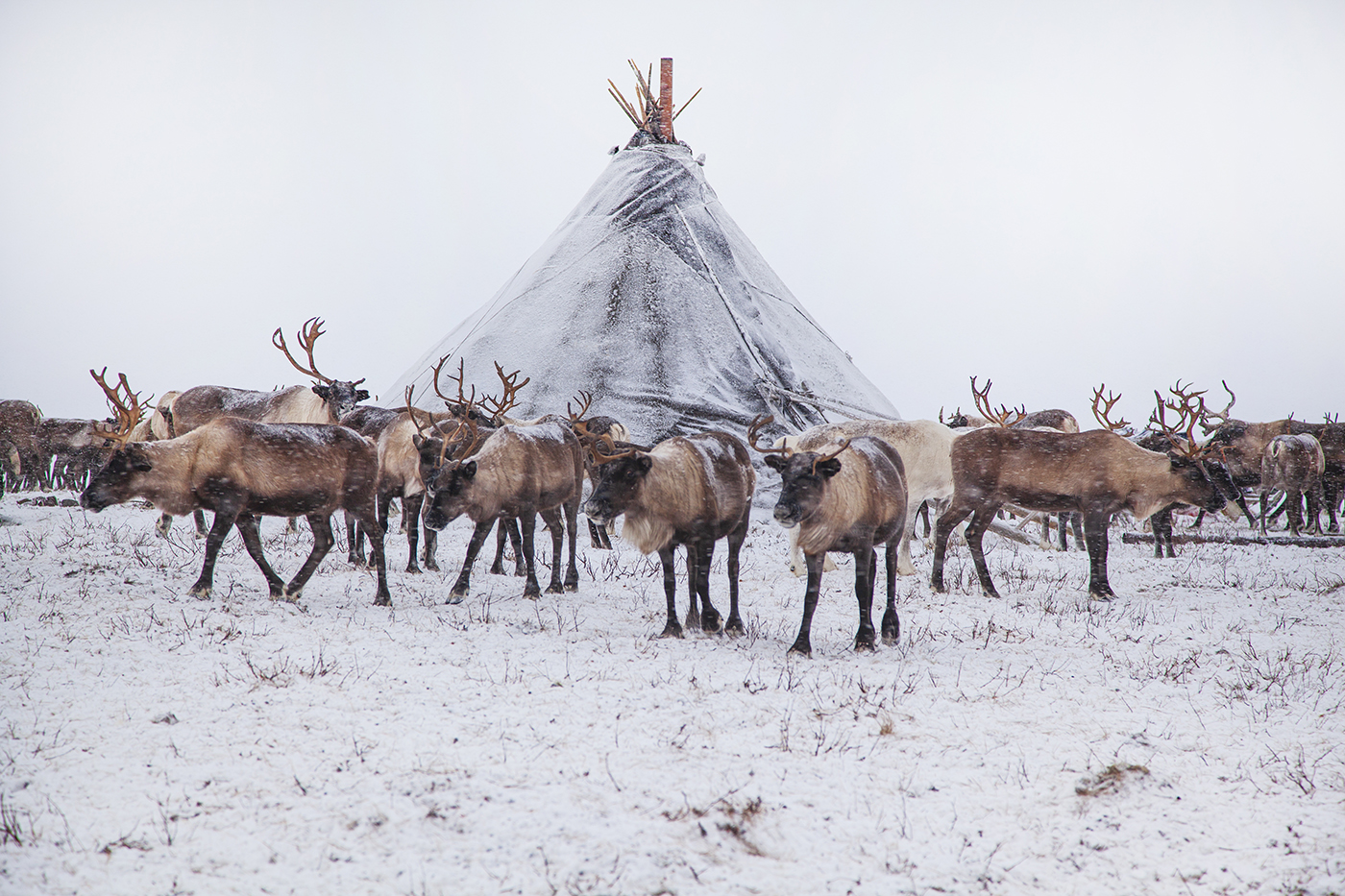
The Surgutsky Municipal District is the largest district of Russia’s Khanty-Mansi Autonomous Area — Yugra, a unique region that is rich in natural resources, culture, traditions and history. The district’s economic welfare has traditionally been linked to its vast deposits of oil and natural gas. However, there is also scope for growth in other areas. The region’s unlimited opportunities for nature-based and ethnic tourism, its propensity for innovation and progressive governance have drawn increasing numbers of investors and travelers.
Our task was to create a place brand for the territory and come up with an image that would resonate with wider audiences. The new place brand needed to encapsulate the extraordinary diversity of the land that has been rightfully dubbed "the Gem in the North".
Our task was to create a place brand for the territory and come up with an image that would resonate with wider audiences. The new place brand needed to encapsulate the extraordinary diversity of the land that has been rightfully dubbed "the Gem in the North".

Idea
We chose the idea of an inexhaustible store of opportunities offered by the Surgutsky municipal district as the cornerstone of our approach. Our key visual device was the variety of perspectives, levels and layers. Indeed, what may at first glance seem like a typical economic heavyweight region is in fact a land that thrives on deep respect for indigenous cultures. And a landscape that may appear rugged and tough will surprise you with the magical colors of northern lights and an abundance of breathtaking natural wonders.


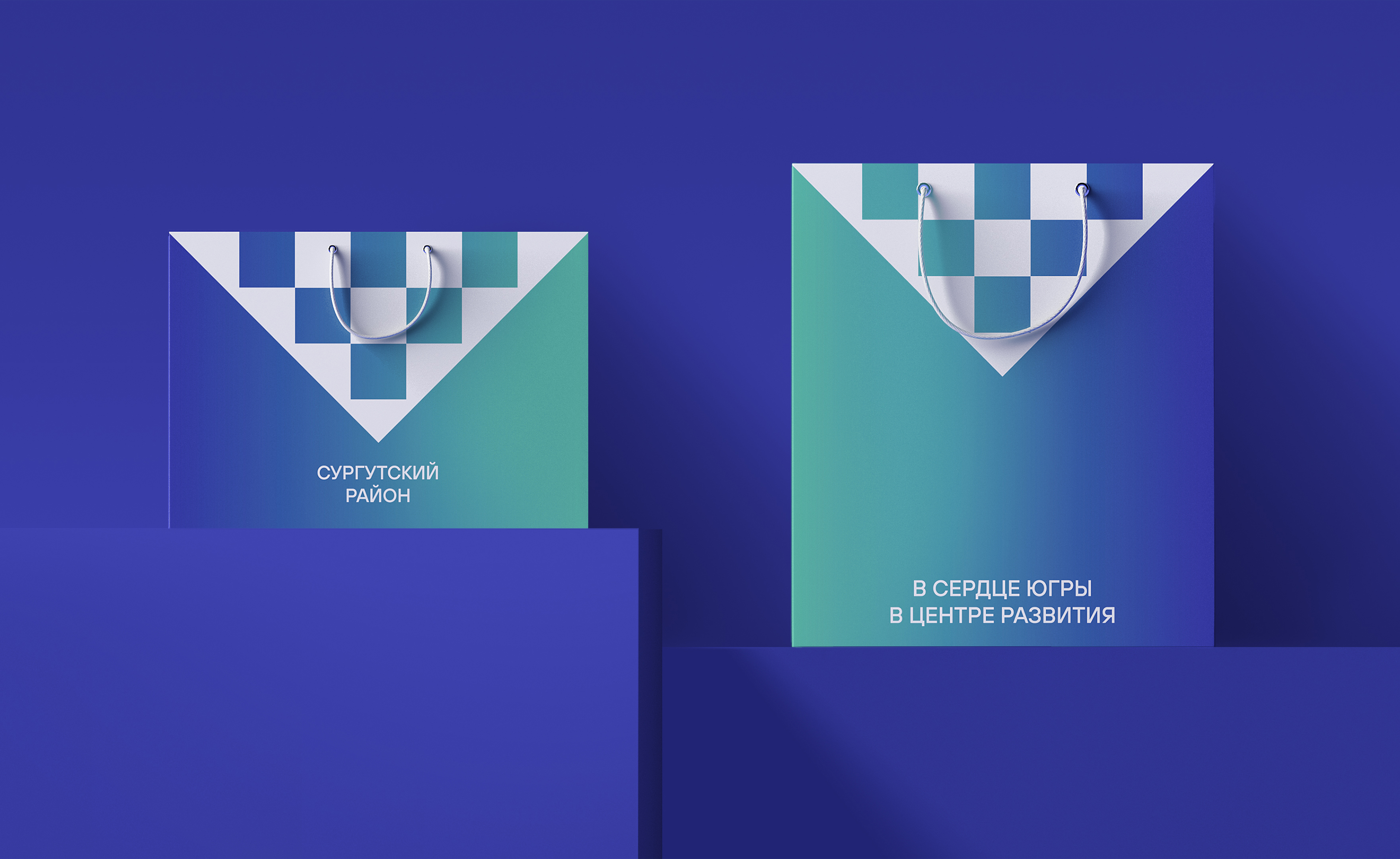
Logo, visual identity, tagline
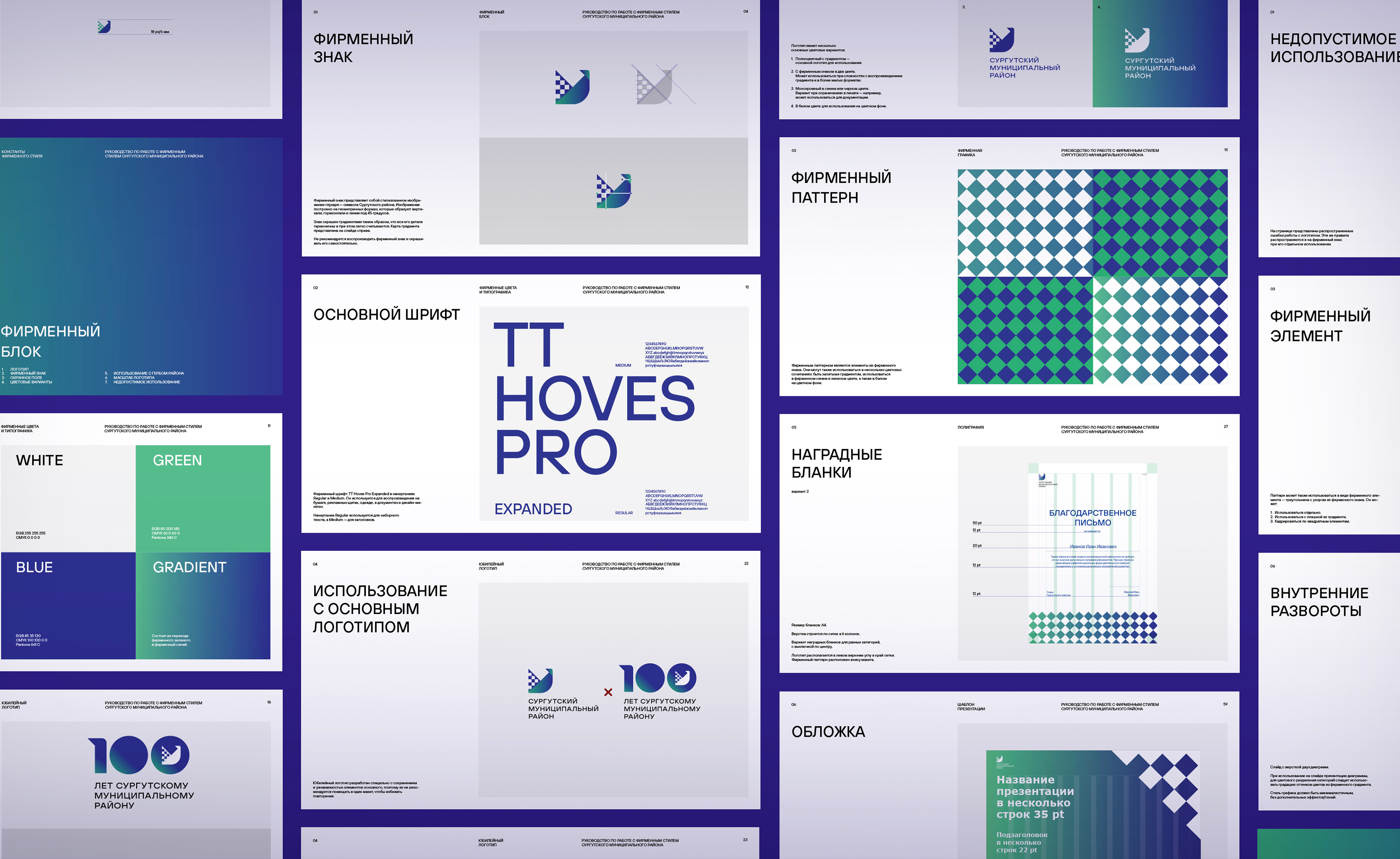
Strictly speaking, creating a new logo is not a rebrand. For years, the region’s coat of arms has been the core of its identity, so our task was to preserve continuity.
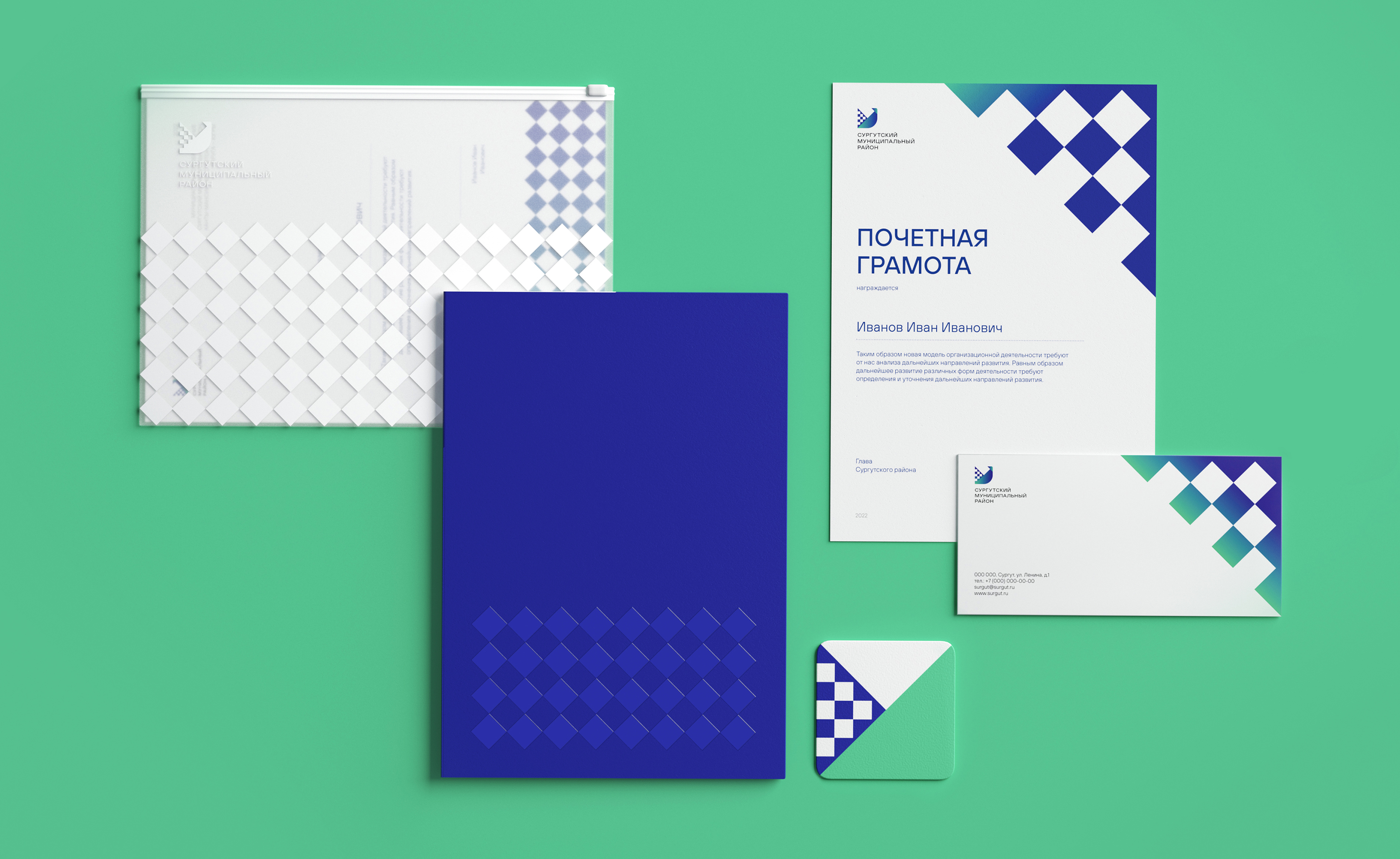
The final logo features a reinvented image of the wood grouse — the animal charge present on the region’s coat of arms. The new wood grouse looks more like an icon, yet it is very distinctive. This solution captures the identity of this fast-growing region and a strong connection to its cultural roots. The logo’s geometry pattern that brings to mind local national patterns becomes the core of the visual identity. The colors are a direct reference to yet another of the region’s top attractions — the vibrant northern lights. The new tagline — "In the Heart of Yugra, at the Center of Growth" - weaves together the main narratives and visuals and turns them into a coherent whole.
The final logo features a reinvented image of the wood grouse — the animal charge present on the region’s coat of arms. The new wood grouse looks more like an icon, yet it is very distinctive. This solution captures the identity of this fast-growing region and a strong connection to its cultural roots. The logo’s geometry pattern that brings to mind local national patterns becomes the core of the visual identity. The colors are a direct reference to yet another of the region’s top attractions — the vibrant northern lights. The new tagline — "In the Heart of Yugra, at the Center of Growth" - weaves together the main narratives and visuals and turns them into a coherent whole.
Further use
Unlike many existing destination brands that live solely on the pages of brand books and on the slides of long-forgotten presentations, the visual identity we created for the Surgutsky Municipal District has been widely used on dozens of different types of collateral intended for daily use. While adapting the visual identity for a specific media, it is essential to make sure that three constants are maintained: the logo and the bird mark, the colors that hark back to the northern lights and the pattern inspired by the traditional art of Yugra’s peoples.


Centennial
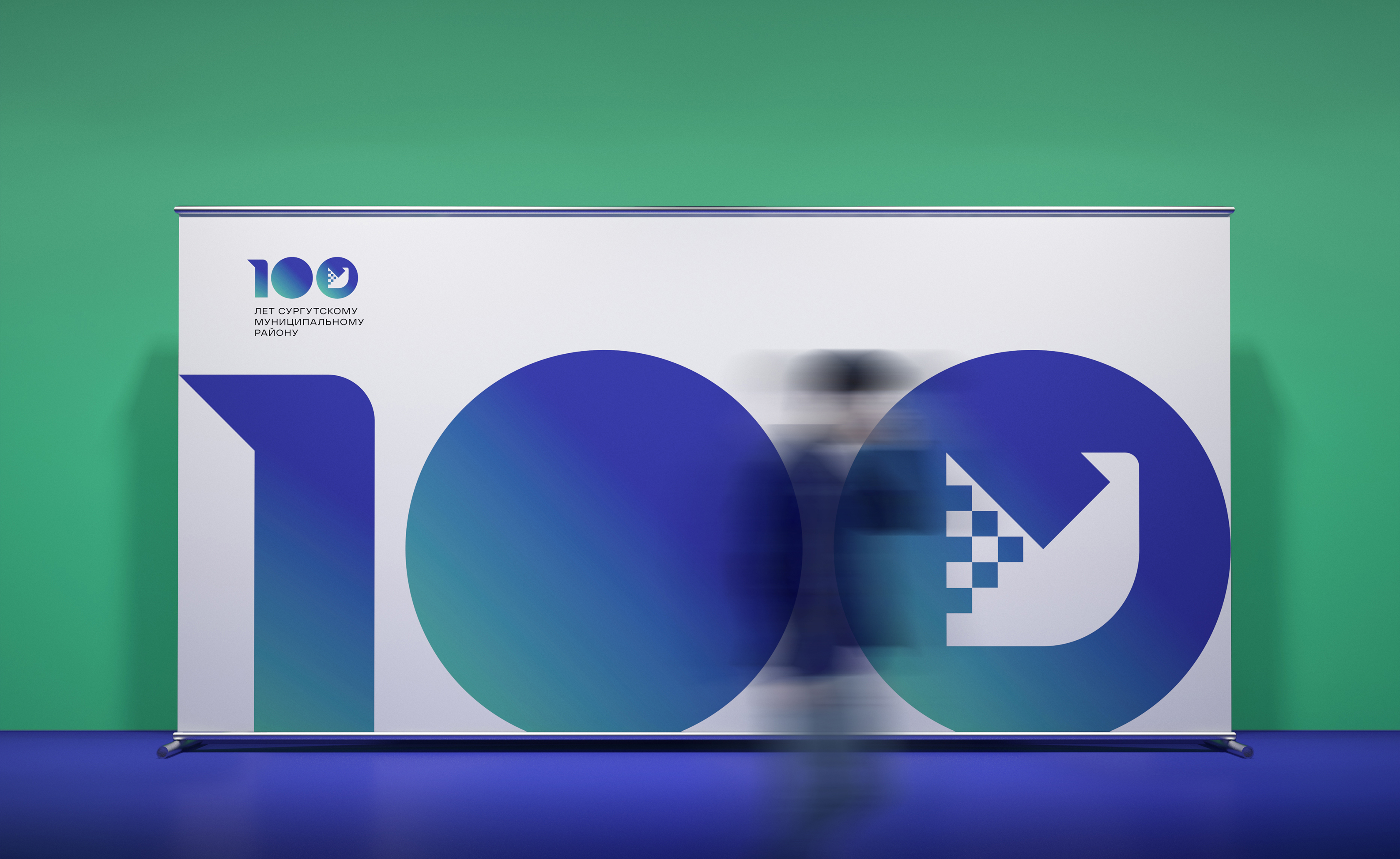
In 2024, the Surgutsky Municipal District is celebrating its centennial. To mark the round anniversary, we designed a special occasion logo that features the number 100 with the city’s pictorial mark inscribed in the last digit. The outlines of the figure of one are a reference to the district’s main logo — it was designed to maintain the connection to the bird mark.


Brand book
We created a detailed brand book that formalizes the visual identity system of the place brand. This is a document that defines how the new visual identity and its main elements should be used and lists the dos and don’ts related to adapting them to all kinds of media, from business documents to souvenir pins.


A comprehensive rebranding project for Rusgranit
Branding and communications development: a comprehensive project for M2_Connect, a digital service provider
To work out a positioning platform for a new hockey team from Uzbekistan