Contact Us
Give us your email and phone number and we will be in touch with a short questionnaire to help us discuss your project in more detail.
Rebranding for Krasnoyarsk Airport
Rebranding for Krasnoyarsk Airport
Krasnoyarsk Airport has a unique geographical position in the heart of Russia. It is a significant cargo-and-passenger transport point. It is located along the Europe-Asia routes and cross-polar routes to North America.
Context

Task
In the brand identity, it is important to reflect the authentic image associated with the Krasnoyarsk Krai, but at the same time to show the workability and modernity of the largest terminal in Siberia and the Far East.
Insight

Development of brand positioning and identification system for Krasnoyarsk airport.
The basis for the idea formation of the brand identity was the course — "Children of the same river." It means that the airport is a starting point in a large megaregion that unites Khakassia, Tuva and Krasnoyarsk Krai around the great Yenisey River
Hypothesis

The airport actively develops a hub system, which is designed to expand the capabilities for receiving and sending commercial cargo. The plans include the creating of a global transport point. Therefore, the main emphasis in the development of identity should not be made on passenger transportation (which, of course, will also be), but on transport and freight service.
The geographical location of the airport has all the prerequisites for the formation of a hub on an international scope. It is located at the interfaces between Europe and Asia, in the middle of the route from Asia to Europe.
The geographical location of the airport has all the prerequisites for the formation of a hub on an international scope. It is located at the interfaces between Europe and Asia, in the middle of the route from Asia to Europe.

Krasnoyarsk Airport has an area of 58 thousand m². In December of 2017, it is planned to open a new terminal with a capacity of up to 5 million passengers per year.
Strategy
Krasnoyarsk Airport is a key point on the map of the region and one of the most important nationwide. In this day of gadgets and universal mobility, we use a geotag — a location marker to indicate important locations. Why not do it for such a super-modern airport?
Concept

The image of the geotag becomes fundamental to the brand identity. Thanks to the laconicism and versatility of the image, it is easily scaled to various carriers of the brand identity, as well as brand communication.
Image
Implementation
For the logo of the new airport, a graphic symbol was formulated, which is a metaphor for the center of Siberia and a symbolic location on a whole country map. The blue ribbon of the Yenisei River passing through it emphasizes the unique character of the location, its individuality and visualizes the course "Children of the same river".
Metaphor
The chosen graphic image conveys to the world the modern, innovative and super eco-friendly character of the hub in Krasnoyarsk. Concise and restrained, the mark becomes a universal marker that simply is scaled to various brand identity media.
Development
One of the leading carriers of the new identity is navigation inside the airport. The system is built on the interplay of the arrow and the display element in the form of a green line. The position of the line depends on the direction of the pointer on the navigation label. If on one of the carriers there are several pointers to different directions, then the lines are also placed on both sides.
Navigation


Communications are based on the essential elements of the brand identity. Depending on the character of the message, logo elements can be embedded in images and convey brand ideas.

Open the Siberian heart
Communications


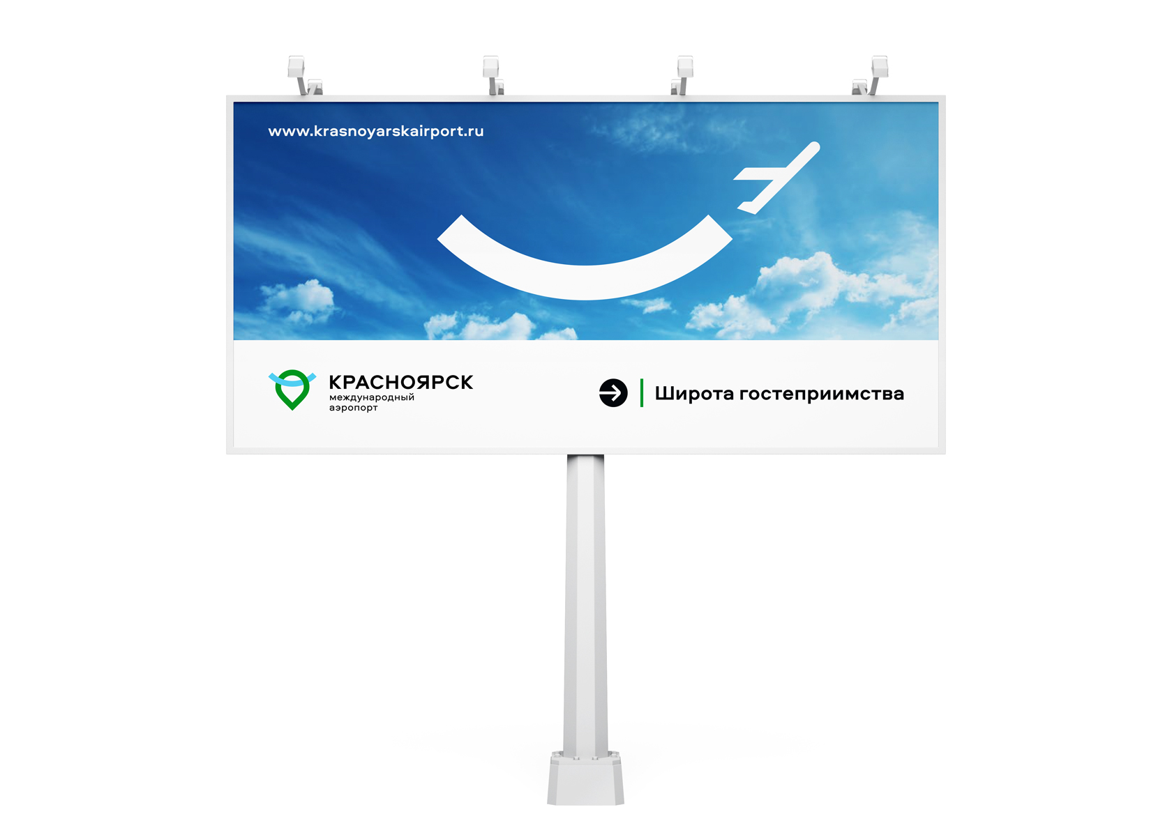
Bright and emotional images are created from the logo elements, reflecting the uniqueness of the brand: they remain the inversion trace of the plane to show a full map of routes; they transform into a mark of the heart or turn into a smile when you need to talk about the breadth of hospitality.
Development

Other corporate branding projects
Rebranding for "Rossiya" airlines
Development of a brand positioning and brand identity for KTIB
Development of a brand positioning and visual identification of the brand
Other corporate branding projects
Rebranding for "Rossiya" airlines
Development of a brand positioning and brand identity for KTIB
Development of a brand positioning and visual identification of the brand
Let's talk about your project
Tell us about your goals, and we'll get back to you right away!
OTVETDESIGN Communications agency © 2013–2023
Office 706, BC Omega Plaza, Leninskaya Sloboda street, 19, Mosсow, Russia, 115280
hello@otvetdesign.ru