Contact Us
Give us your email and phone number and we will be in touch with a short questionnaire to help us discuss your project in more detail.

Package
Logo
Illustration
Packaging redesign and rebranding for a line of ready-to-cook products by Novoferma
From B2B to B2C
For quite a while, Novoferma has been known solely as the main supplier of ready-to-cook ingredients supplier to KFC in St Petersburg. Despite the brand’s technological prowess and its high-quality products, there was a need for a rebrand as the company was planning to reach the B2C segment.
It was crucial to come up with a new approach to packaging design and visual identity to turn them into a powerful channel of communication between the brand and a wider audience of retail consumers.
It was crucial to come up with a new approach to packaging design and visual identity to turn them into a powerful channel of communication between the brand and a wider audience of retail consumers.


Idea
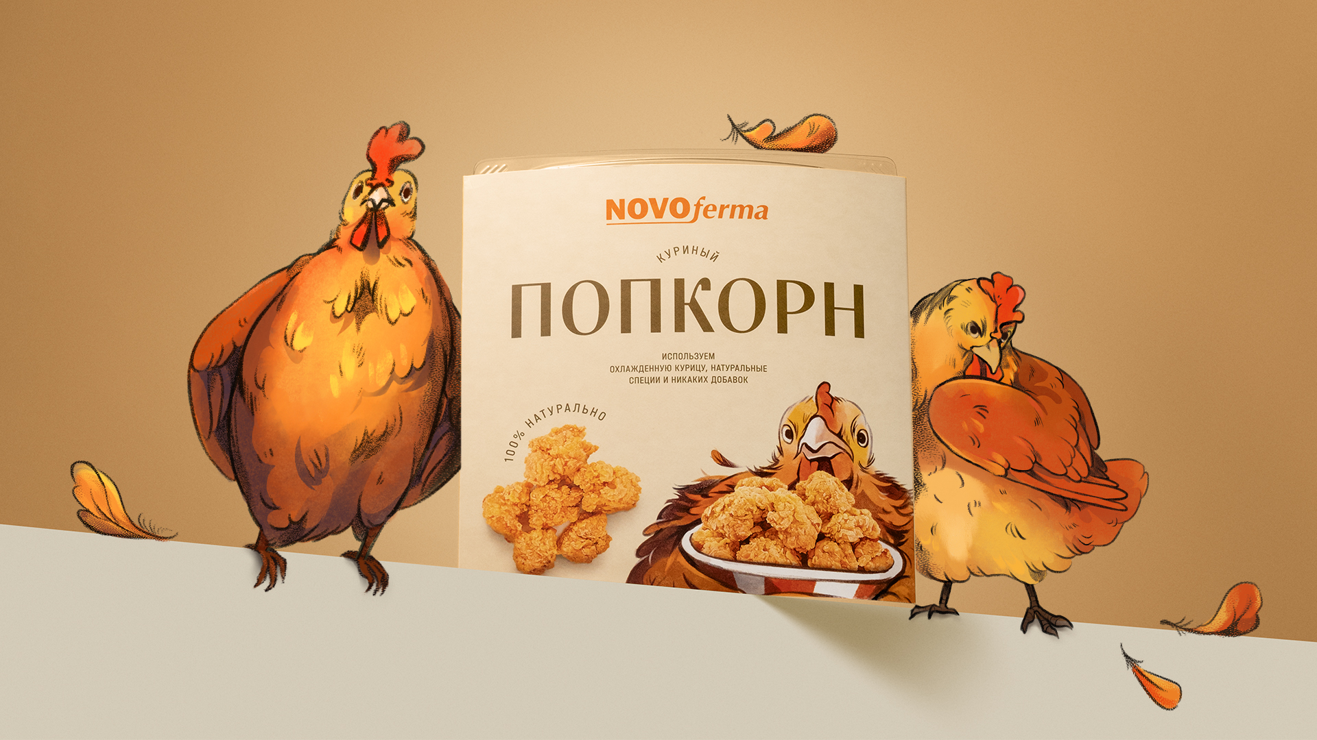
When they come straight from the package, frozen ready-to-cook products are a far cry from your crispy juicy chicken nuggets, hot and fresh out of the frying pan, that will make your mouth water just by looking at them. What the new packaging needed was an eye magnet — something to catch the attention of the shoppers walking past the freezer cabinets of a grocery store. Our idea was, firstly, to turn the savory, mouth-watering product into an eye magnet. And, secondly, to create an array of original characters with enough personality and charisma to serve as the brand’s mascots and win both the packaging game and the consumers' hearts.
Food styling
We needed a packaging the customers would instantly want to get their hands on. This is why we paid particular attention to food and image styling. The new packaging features large images of the products represented from different angles to make differentiation easier. After all, the customers do care what the product will look like when it comes out of the microwave oven, and they want to know exactly what they are buying.


Mascots
To turn the package into a powerful communication channel, we created a series of characters — chickens, turkeys and other colorful and authentic animal residents of the Novoferma farm. Each character is on the move — pushing a cartful of crispy nuggets or holding out a plate of freshly-cooked chicken popcorn for our evening tv time. The characters are whimsical and fun, yet by no means grotesque or lame, so the brand is still perceived as higher-priced. On each package, the characters interact with the product claims so the customers have no problem with product differentiation.


Rebrand
Thanks to the new design approach, we managed to communicate the product’s features and capture the brand’s overall attitude and its values. This is especially important for a brand who needs to secure a foothold in the market of ready-to-cook products where there is a high impulse purchase rate and an emotional connection with a brand often matters as much as rational reasons.
Packaging and logo redesign for a line of bug repellents by Komaroff
Creation a product that moves with the times for the main audience and object of desire for a younger group of consumers of generation Z and millennials
Making a packaging standing out from a common communications clatter and gain consumer loyalty in the household segment